
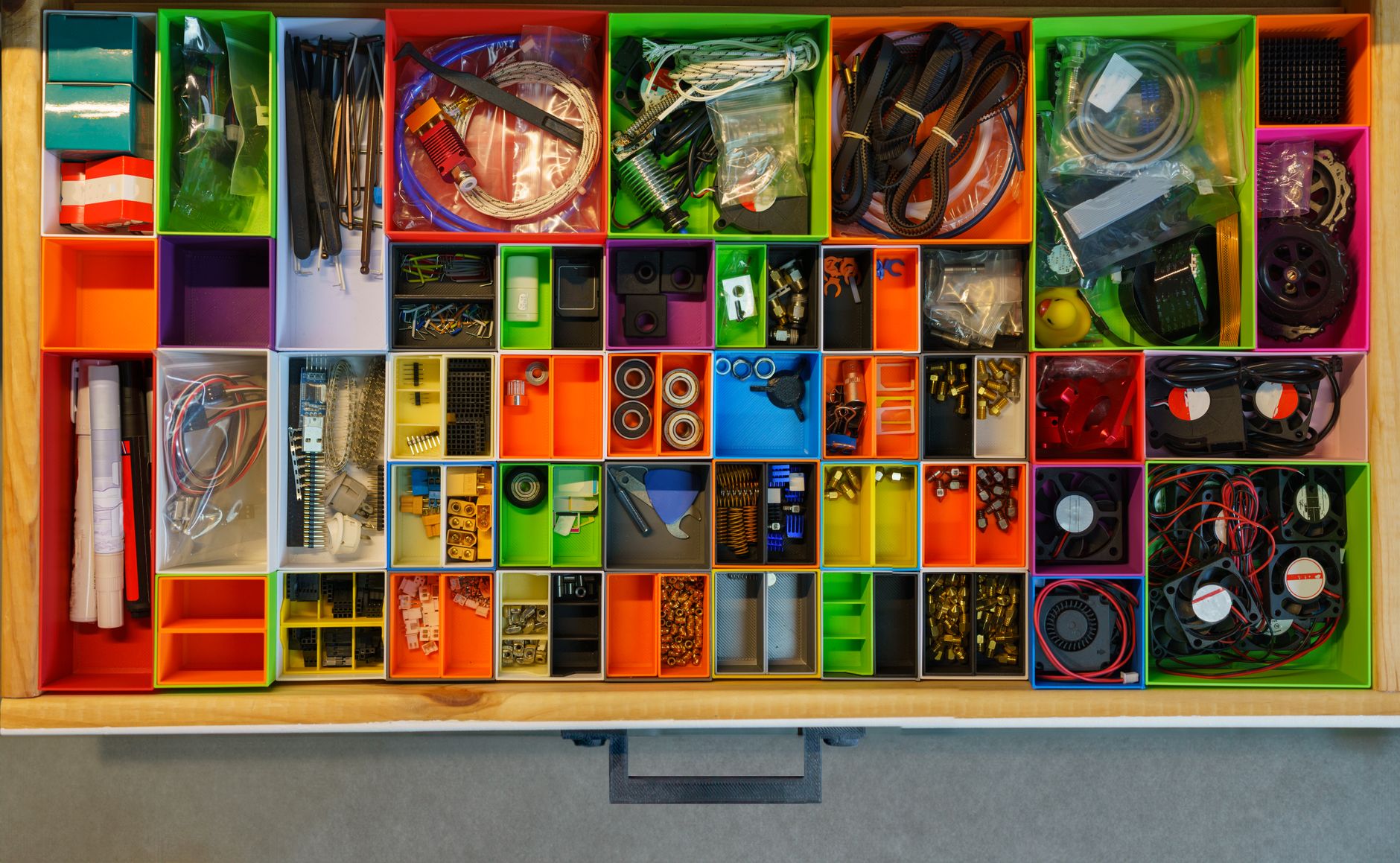
If you run a small business or nonprofit, there’s a good chance your website content happened the way most website content does: page by page, request by request, with new content added on wherever there was room. Nobody planned it that way. It just happened.
I’ve spent years as a website specialist working on layout and content for small businesses and nonprofits, and now I run my own business helping organizations keep their websites updated and organized. I’ve worked on the content and structure of several nonprofit websites, and I’m currently working on projects for both nonprofits and corporate clients. The pattern I see over and over is the same: the organization knows exactly what they do, but their website doesn’t communicate it clearly. Visitors land on the site and have to work too hard to figure out if they’re in the right place.
Organizing your website content well isn’t about making things look pretty. It’s about removing friction so visitors can find what they need, understand what you offer, and take the next step, whether that’s donating, registering, or calling you.
Here’s how I approach it, with real examples from my own work.
Start with a Website Content Audit
Before I touch layout, navigation, or design, I do a full content audit. I go through the existing site page by page and ask two questions: What is this site currently communicating? And what’s missing?
This step matters because most organizations don’t actually know what their website says. They know what they meant to say. There’s almost always a gap between the two. A content audit shows you that gap in black and white, before you start moving things around.
Skipping this step is one of the most common mistakes I see. People jump straight to “let’s redesign the homepage” without ever stepping back to ask whether the content itself is doing its job. If you’re not sure where to start, auditing your website content doesn’t require any technical skills, just a clear eye for what’s missing.

Understand Your Audience and Your Goals Before You Touch Navigation
Once I know what’s currently on the site, I shift to understanding who the site is actually for and what the organization is trying to accomplish. A nonprofit’s goals (donations, volunteer sign-ups, program awareness) are different from a corporate client’s goals (leads, sales, credibility). The content and structure need to reflect that difference.
This is also where I hold a content brainstorming session with the client. I ask questions designed to get past the internal jargon and surface what actually matters. Three that consistently produce the best answers:
- If someone remembers only one thing about your business after visiting the website, what should it be?
- What makes your business or nonprofit different from others?
- Why should your audience care about what you’re offering?
These questions sound simple, but they’re the ones that get organizations to articulate things that never made it onto their website in the first place. I’m currently working with Dona Vista Arts, a nonprofit supporting students in arts and culinary programs, and this is exactly the gap I see on their current site. Their existing content is basic. It doesn’t fully communicate the scope of what they do, their goal of expanding arts opportunities in their community, or how someone could actually get involved through donating or volunteering. That information might exist somewhere in the organization’s head, but it isn’t on the page, which means visitors never get it.
Organize by User Intent
This is one of the biggest shifts I push clients toward: structuring the website around how a visitor thinks and searches, not around how the organization is internally structured.
Internally, organizations often want their navigation to mirror their departments, programs, or org chart, but visitors don’t care about your internal structure. They care about finding the answer to their question as fast as possible.
When I worked on the Highlander Summer website (a previous role, not a project through my own business), the existing navigation was built the way the team internally thought about their programs. I restructured it based on how a visitor would actually look for information: I merged some pages, created new ones, renamed nav labels, and reordered menu items to put the most likely destinations first. At the time, they didn’t have Google Analytics set up, so I couldn’t point to click data to justify those choices. I made the call based on what visitors would most likely be looking for, given the type of organization and the goals we’d identified. It was an informed judgment call, not a guess, but I’ll be honest that “informed judgment” and “confirmed data” are two different things, and I’d have preferred to have the data.
Once we did get Google Analytics implemented, the results validated the approach: high traffic, fewer support calls and emails asking questions the site should have already answered, and consistent feedback from the team and even other summer camps about how easy the site was to navigate.
The lesson here isn’t “always restructure first and check the data later.” It’s that user intent should drive your structure, and data should be brought in as early as possible to confirm or correct your decisions. If you already have analytics, use them from day one. If you don’t, get them installed before you start, not after.
Lead with Clarity on the Homepage
I believe every homepage should open with an image or video paired with concise text that tells a visitor, within seconds, what the organization or business does. Not a tagline that sounds nice but says nothing. Not three paragraphs of mission statement before getting to the point. A visitor should be able to glance at your homepage and immediately know whether they’re in the right place.
On the Highlander Summer project, part of what made the redesign work was pairing updated photography with content that gave real detail: the different types of camps offered, what to expect, and how to get involved as a camper, employee, or volunteer. We also strengthened the calls to action throughout the site, so visitors weren’t just informed, they were given a clear next step. That combination, clarity plus a visible next action, is what turned the site from “cluttered and lacking information” into something the team itself was proud to point people toward.
Keep Navigation Limited and Make Parent Pages Worth Clicking
Two mistakes I see constantly, on opposite ends of the same problem.
The first is cramming every single page into the main navigation menu. I understand the instinct. Every page feels important to the people who built it. But a navigation menu with 15 items isn’t helpful; it’s overwhelming, and it gets significantly worse on mobile, where all those items have to collapse into a small space and somehow still make sense. A long, cluttered menu makes visitors work harder to find what they need, which is the opposite of good content organization.
The second mistake is the inverse problem: organizations that don’t think a parent page needs to be a real destination on its own. The assumption is that visitors will only ever land on child pages, so the parent page either gets left thin and empty, just a placeholder to hold the dropdown together, or its content gets copy-pasted across each child page instead, repeating the same information in multiple places. I’ve seen both versions happen with About Us pages specifically: either the page itself says almost nothing, or the same overview paragraph shows up again and again under every sub-page. Either way, the parent page never gets to do its job, which is to give visitors a clear overview before they decide which child page actually answers their question.
The fix for both problems is the same: be deliberate about what earns a spot in your main navigation, and make sure every item in it, including parent pages, clearly leads somewhere worth going.

Design Mobile-First, Then Test the Layout
My approach to layout is mobile-first, and I’d push back on anyone who treats mobile as an afterthought. Mobile-first design isn’t just about font size and tap targets. It affects layout decisions you might not expect.
On the Highlander Summer site, I originally used an alternating layout style for several sections: image on the left with text on the right, then text on the left with image on the right for the next section, and so on. On a desktop, it looked great. It created a visual rhythm down the page. On mobile, it fell apart. The image and text blocks ended up stacking directly on top of each other, looking repetitive and disorganized rather than intentional. I had to adjust the layout specifically to account for how those elements would flow on a smaller screen.
The takeaway: a layout decision that improves the desktop experience can quietly damage the mobile experience, and most of your visitors are probably on mobile. Always check how a layout flows before you finalize it, not just how it looks at full width.
Write the Content, Then Build the Pages
Once I have the audit, the audience and goals, and the brainstorming session input, I write the content based on what already exists on the site, filling in real gaps with new content where needed. Only after that do I move into building pages and finalizing the layout.
I do this in that order on purpose. If you build the page structure first and try to write content to fit it, you end up forcing your message into a shape that doesn’t actually serve it. Writing first means the content dictates the structure, not the other way around. The page exists to support the message, not the reverse.
Why This Matters
None of this is complicated in a technical sense. It’s not about cutting-edge design trends or the newest website builder. It’s about being deliberate: knowing what your content currently says, knowing what your audience actually needs, organizing around their intent instead of your internal structure, and testing your decisions on the same devices your visitors are actually using.
The Highlander Summer project is the clearest proof I have that this approach works. A site that was cluttered and lacking information became one with high traffic, fewer support questions, and genuine praise from the team and other organizations in the same space, all from applying exactly the process described above.
If you’re a small business owner or nonprofit leader reading this and thinking, “I know my website needs this kind of attention, but I don’t have time to audit pages, interview my own team, rewrite content, and rebuild navigation while also running my organization,” that’s a completely reasonable reaction. You shouldn’t have to choose between running your business and fixing your website. That’s exactly the kind of work I do for clients, so they can stay focused on what they do best while their website finally does its job.
Leave a Reply